


CI
CI Introduction
THE INUS inherits 45 years of brand heritage.
Moreover, the CI represents a strong will to create a differentiated value,
thinking beyond the current business areas and existing opportunities.
BASIC LOGO
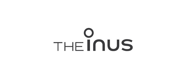
The smooth curved design and stylish typography font make the logo stand out.
KOREAN WORDMARK
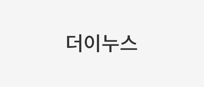
In documents that cannot utilize the watermark, 'THE INUS' is capitalized, and in documents that can be typewritten, 'Noto Sans KR_Medium (letter spacing -25 / length-width ratio 98%)' is used in Korean and 'Noto Sans KR_Medium (letter spacing 0 / length-width ratio 100%)' is used in English.
COLOR SYSTEM
THE INUS corporate logo has two main colors – dark gray and warm creamy white.
Dark gray color stands for our well-established status and graceful image, while warm creamy white color symbolizes elegant,
comfortable and secure residential spaces created by THE INUS.
-
THE INUS Black
CMYKRGBHEX
0,0,0,9025,25,25#191919
-
THE INUS Gray
CMYKRGBHEX
0,0,0,45140,140,140#8C8C8C
-
THE INUS White
CMYKRGBHEX
0,0,2,2250,250,245#FAFAF5